Sunday 30 September 2012

National Geographic - October 2012 edition

It is hard to comment on the images from National Geographic; I subscribe to the magazine, partly because I am intersted in natural history, anthropology, geology etc, but also because it gives me access to stunning photographs.  So selecting individual shots out for a particular merit is tough, because they are all amazing.  The October 2012 edition had a particularly interesting and saddening article about ivory poaching and the plight of the donor elephants.  The associated images are distressing yet compelling.  Not images to hang on the wall, but images that give you so much information that you actually don't need to read the article to get the message.  In contrast, I really enjoyed looking at the landscape views of the "Sky Caves of Nepal" and the charming sequence "Once Upon a Home" showing some animals that had moved into deserted cottages in Finland.

Whilst reading the October edition, I noticed that a number of images that could have been cropped to square format with central composition, were left rectangular with composition following the rule of thirds.  This provides a sense of space and a dynamic relationship between the subject and its environment.  For instance, the turtle on page 96 would have worked very well as a centrally composed portrait of the turtle, but including more of the background water and sea plants tells you something about the space that the turtle occupies.  Something to remember...

One image though that I particularly liked was the picture of the whale shark on page 145 taken by Brian Skerry called "Big Fish, Little Fish": a simple and striking colour pallette of turquoise, shades of grey and white, centrally composed without any distracting information in the background and a sucker fish in the shark's mouth just off-centre towards the bottom LFS.  The photographer said that the shark would not eat either the fish nor him, yet nonetheless I bet he was scared!  The presence of the little sucker fish contrasts and highlights the enormity of the whale shark.

Tuesday 25 September 2012

Southbank (c) Tim Morland

Another inspiring image a from fellow Camera Club member with lots of "wow factor".  This is a stunning example of use of HDR (see previous reference to HDR), which Tim created from three different exposure conversions shot in a RAW file (so no need to take three images on a tripod as previously thought!).  I love the light in this image illuminating the Tower of London and Tower Bridge, the fact that the people and dog actually appear to be in motion and the way the eye takes you round the curved building of City Hall to the same point on the horizon that the river and banks take you to.  The sky is also very dramatic with the clouds appearing horizontal from the wide-angle lens effect and the darkening effect at the top of the sky (polariser or n-grad?).  If you look closely at the river you can see ripples also, which appear to be moving - this is the HDR effect.  The effective horizon line is only just below the vertical halfway point, yet this does not matter.  There is so much drama in the sky and so much movement in the lower half of the image with the movement along the South Bank that the overall effect is still dynamic.  In addition, the composition is broken up by the City Hall structure occupying a good chunk of the left-hand side, breaking up the horizon.  I am also drawn to this image because I used to work in St Katharine's Dock, just behind Tower Bridge, and so used to regularly walk this route from London Bridge and then crossed the river at Tower Bridge to get to work.


Southbank (c) Tim Morland

This view is not too dissimilar to a shot I had taken previously using a fish-eye lens for my work on contrasts in section 1 of TAOP to illustrate the contrast between old and new architecture, which in fact I didn't use in the end, although I much prefer Tim's composition, lighting and sky - well the whole thing really!


But, I am now tempted to go back to the same location and have another go!  And I have to learn how to use my software (keep saying this) to have a go at HDR! (I have just realised that my software doesn't support HDR, so I now have an economic conundrum to resolve....)

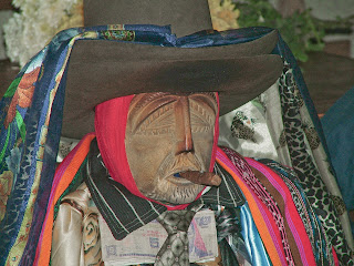
Maximon (c) Brian Collins

I saw something new last night: Maximon, photographed by a fellow Camera Club member (reinforcing my view that the role of the photographer is to document and inform).  Maximon is a Mayan folk saint venerate during Holy Week (for more info see Maximon).  I was drawn to this image, not only because it is unusual and is showing me a subject that is new to me, but also because of the lighting in the image. There is fantastic tonal contrast in the monochrome version and you image from the variety of patterns in the fabrics adorning the statue that in real life the whole thing is probably quite garish or gaudy.

Maximon (c) Brian Collins

But, when you see the original, that there are some bright colours, but also some rather subdued hues as well, which surprised me.

Maximon (c) Brian Collins

You can really see how the black and white conversion has strengthed the image and brought a quality of light that enhances the final product. I also really like the tight framing; the photo is all about the effigy and nothing else; also the black and white version helps play down the background.  I would now be interested in seeing more Mayan artifacts!


To A Point (c) Keith Wellbelove

A graphically striking image by a fellow member of my Camera Club.  I love the clear lines and strong yellow and blue - great timing from my perspective as I am currently working on Part 3 of TAOP dealing with colours. As far as elements are concerned, there is clear direction in this image with the black and white bend sign taking the eye to the focal point in the top left hand corner, plus a pattern formed by the shadow of the railing.  The colour saturation is great, rendering the image from a landscape to almost an abstract.  For me, this is one of those "wish I'd seen that" images!


To a Point (c) Keith Wellbelove

Sunday 23 September 2012

Fire Tornado


Metro newspaper, 17 September 2012, featured a photograph by Chris Tangey of a fire tornado in Alice Springs, Australia.  Impressed, because not only that I didn't know fire tornados existed (I'm 44! - how did this happen?) but the photograph is stunning.  Lucky photographer being in the right place with camera in had (I would miss the moment checking settings...) but the image is perfectly composed with the vertical and horizontal lines along the rules of thirds, plus that bright orange accent against a neutral background of grey swirling dust in the wake of the tornado, and the yellow/green grass and scrub.  And when you look closely again you see red/pink within the charcol grey dust - a really effective colour scheme.  All the warm colours, red, orange and yellow are present, against the cool green and harsh grey.  Fabulous! Wish I'd been there!

Fire Tornado (c) Chris Tangey


Peter Cairns

On 3 September 2012, I went to a talk at Ludshott Camera Club by an extraordinarly photographer, Peter Cairns.  Cairns is a wildlife photographer and I would challenge anyone who said his images aren't incredibly stunning.  What is interesting about Cairns is that he is primarily interested and motivated by ecology and conservation.  He claims that photography is just a means of expression.  Looking at his images, it's hard to believe that his relationship with photography is so casual; they are so stunning that you can't imagine anything less than hard work and devotion to the cause.  But he is passionate about protecting the environment and uses his art to communiate to the world through his participation in various collaborative projects, such as 2020 Vision and Wild Wonders of Europe.

Cairns is also inspiring as he has achieved what I would like to do; he's left the world of 9-5 (or 8-6 in my case...) and changed his life moving to Scotland to fulfill his ambitions.  I would definitely like to see more of his work and perhaps get some tuition from him one day on one of his workshops or tours.

No point in critiquing his work, or even picking a favourite image; it's all amazing.  Just look:  http://www.northshots.com/

Mind you.. I do like the Lynx in the snow, and the walrus, Scottish wildcats, and the owls....

Saturday 8 September 2012

Macolm Browne

I saw in the news this week that Malcolm Browne, the associated press photographer in Saigon during the Vietnam War, had died on 29th August.  Browne is known for his disturbing image of Thich Quang Duc, a vietnamese monk, who set fire to himself in a Saigon street in an act of self-immolation on 11 June 1963, which won a Pulitzer prize. 

Browne won the World Press Photographer of the Year competition in 1963 for a similar photograph:


I prefer the top photograph - the Pulitzer one.  You can see the crowds of monks standing by and the nearby car with its bonnet open.  It's hard to imagine seeing such an event for real and on top of that being able to stand there a take a photograph, although this must be true of war photographers in general.

More of Browne's photographs in a collection of images showing the atrocities of the Vietnam war are available through this link:

Another London

The "Another London" exhibition was held at the Tate Britain in London during the summer of 2012.  The exhibition showed photographs of London captured by international photographers between 1930-1980; some tourist, some journalistic assignments, some as refugees; all different.  What was fascinating about this collection was that it has documented artifacts, customes, a way of life that has now disappeared.  I saw things that I remembered from my childhood in the 70s that I had forgotten all about.  This really brought home to me about the fact that whether the photographer deliberately tries to or not, each one is documenting life at the very moment the shutter is pressed.  The photographers and images are too numerous to comment on individually - and there were some really iconic scenes in this collection and a few that would be distrubing had they been taken now.  I have put the catalogue on my Amazon wishlist so that I have a permanent record of the exhibition.  I have found a few articles that also describes the exhibition and show some of the images:

http://www.ft.com/cms/s/2/4fe51e9a-d1d0-11e1-bb82-00144feabdc0.html#axzz25rFGuWTi

http://www.guardian.co.uk/artanddesign/2012/jul/29/another-london-photographs-tate-review

http://www.guardian.co.uk/artanddesign/gallery/2012/jul/23/another-london-tate-britain-in-pictures

Seeing this exhibition has got me thinking about what is considered normal now that I could capture, which in 20-40 years time might disappear and find its way into a catalogue of life in the 20teens.

Travel Photographer of The Year 2011

I visited the Royal Geographic Society on 18 August 2012 where the winning images from the 2011 competition were being exhibited.  The advertising alone on the RGS website told me that this was going to be amazing - and the captivating image in question of  scuba diver swimming alongside a beluga whale was just incredible.  I was also interested to see images from West Africa, having spent some time there myself.  What I liked about this exhibition was that it didn't just show one image from the winning photographer, but a selection of images.  In addition, it showed images from previous winners making the most of their prizes.  And I also liked the fact that some vintage photographs were shown.

This exhibition made me want to get out and go travelling again.

My only criticism was that on the day in question, it was brilliant sunshine, which made it had to look at the white outdoors stands because of the glare. 

Of course, I took advantage of the special offer for all four books, which I am looking forward to reading!

For more information see:

http://www.tpoty.com/

http://www.bbc.co.uk/news/magazine-18522990

Vauxhall - early evening..

I saw this view walking back to Vauxhall from the Tate Britain and really wished I had my camera....and stupidly I now have a handbag-sized Canon and still haven't got round to putting it in my bag...perhaps this is why my street photography isn't advancing....

Anyway - I was struck by the irony of the beauty of the evening light reflecting off the new, modern apartments and the poor man making his evening resting place by the Thames with his collection of carrier bags. Bizarrely, even though he lives on the streets, he realised I'd taken this with my iPad and still yelled at me!