Sunday, 28 April 2013

Heather Angel

I was lucky enough last week to go to a talk by Heather Angel at Guildford Photographic Society.  Heather gave us a beautiful slide show showing her macro and wildlife images and provided us with some much valued "pearls":

Macro:

  • Work hard on backgrounds - they can make or break a photo
  • If no flash - can use camera bag to cast shadow to make background black
  • Use diffuser to reduce light on subject
  • Metering pale or dark subjects - spot meter an average tone
  • Use a reflector to bounce sun into flower centres
  • Use a light tent for photographing individual flowers - produces even lighting - botanical painting effect!
  • Bright colours with dark areas - use flash
  • Fibre optic light good for texture
  • Black velvet and plamps to create black background
  • Focus stacking to create total depth of field
Wildlife/travel

  • Expect the unexpected
  • Meter off neutral tones if subject mainly black or white  
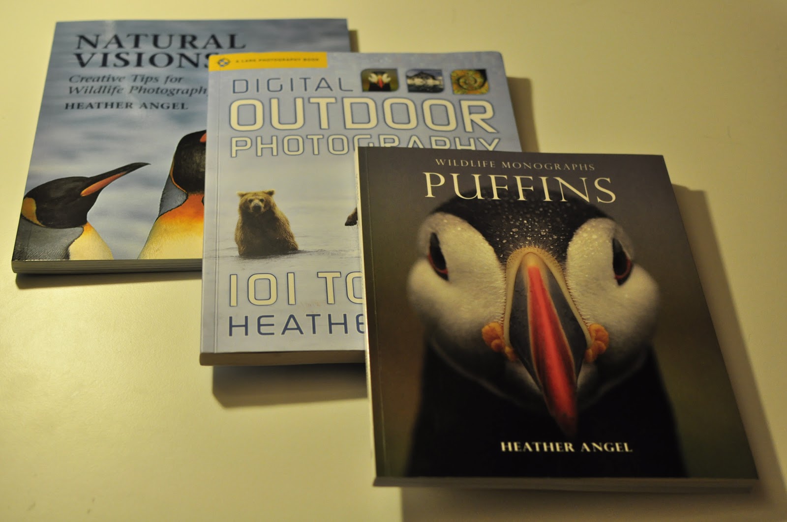
And of course I bought a few books, particularly in preparation for my forth coming trip to Skomer to photograph puffins :-)


Landmark: the Fields of Photography

I visited the Landmark: the Fields of Photography exhibition at Somerset House a couple of weeks ago.  Very interesting!!  These were not your usual landscapes - each one had a twist: beautiful, macabre and bizzare - scars, change and beauty all combined.   Curated by William Ewing, the images had been grouped together in themes: Sublime, Witness, Pastoral, Datum, Landmark, Scar, Delusion, Control, Reverie and Hallucination, but I found that walking through, I didn't pay much attention to the themes - I was so captured by the strength and overwhelming prescence of the photography.

Here are a few of the images (amongst the very many) that I particularly liked:

I was particularly keen to see the image that had been used for the advertising - Nickel Tailings # 34 and also # 35 by Edward Burtynsky - interestingly a Prix Pictet shortlister up for the Water portfolio:


Nickel Tailings #34 & #35 (Diptych)<br><a href='/portfolios/water-shortlist/edward-burtynsky/nickel-tailings-34-35-diptych/'>More information</a>
Nickel Tailings # 34 and # 35 (c) Edward Burtynsky


Of course these images are about contamination but they are stunning. Simple, effective, limited colour pallette (which helps make the red more striking) - they remind me of a river of blood.

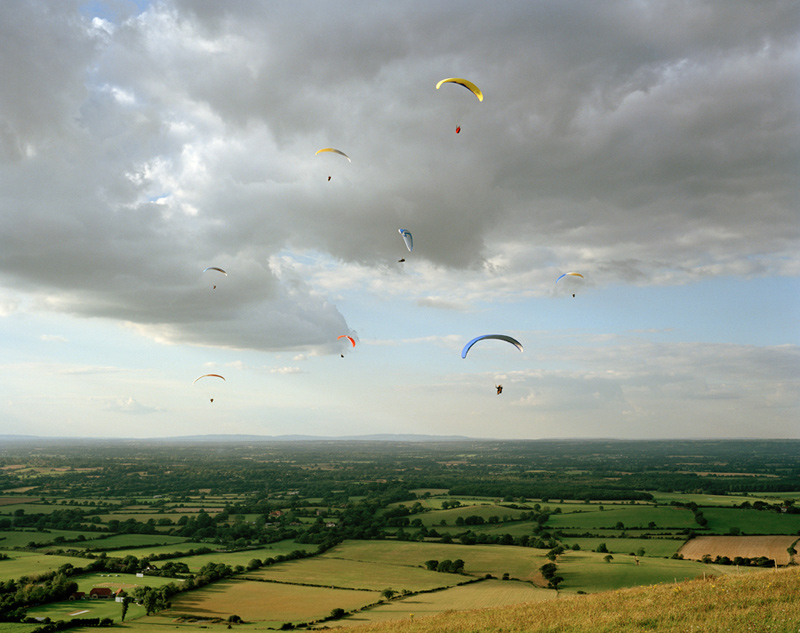
Less disturbing and significantly calmer is the image from the "We English" series by Simon Roberts: South Downs Way:

South Downs Way (c) Simon Roberts
This is a sight I often see in Cumbria with people jumping off the fells sides and parachuting down to the ground.

I found the images by Peter Bialobrzeski about urban wasteland transformations - this image from the Lost Transition series is almost ghost like:


Transition # 20 (c) Peter Bialobrzeski

Moving on to extreme weather photographer Mitch Dobrowner; to say this image is stunning is an understatement!  The small detail of the lit trees brings perspective and context to the overwhelming storm clouds - I love the composition in this image with the storm occupying the bulk of the frame:

Trees-Clouds (c) Mitch Dobrowner


Being a big fan of polar landscapes (and desperate to see in real life) I loved the work by Olaf Otto Becker from the series "Above Zero"; again limited colour pallette, simple composition, strong graphic lines - seems to be a winning formula for landscape photography:

River 1. Position 7.  Greenland (c) Olaf Otto Becker

Another limited pallette, "The Upside Down House" from the project "Tethered to the Polestar" by Ivar Kvaal, obviously a scene of destruction, but also of calm - an "after the storm" feeling:

The Upside Down House (c) Ivar Kvaal

These are just a few of the amazing scenes that were on display; I realised that in picking out hte images that most appealed to me, I was drawn to limited colour pallettes, strong graphic lines, and quite simple compositions.  These are themes I should explore through my own landscape photography!
Saturday, 23 March 2013

National Geographic - March 2013 edition

This has to be the cutest picture ever...a four day old hoglet wrapped up in a towel at a rescue centre.  Getting over the cute factor for a brief moment - this is a very carefully constructed image with the folds of the towel complementing the folds of the hedgehog's face wrinkles and the shape, and the lines of the spines complementing the lines of the edges of the towel. The softness of the towel contrasts with the prickles of the hedgehog.  Obviously careful lighting/exposure to create the light within the white of the towel and I'm guessing this has been taken with a macro lens.  The photo is attributed to Phil Yeomans of the Bournemouth News and Picture Service.  Thank God for rescue centres!

March 2013 NG - Photo by Phil Yeomans


Photography Monthly - April 2013 edition

I loved the images of Clevedon Pier pages 22-25 used to advertise this month's geocaching competition.  They look deliberately over exposed, with suitably blurred backgrounds, disappearing horizons plus some kind of processing treatment that has made them look elegantly faded called "paint the moon" that adds luminosity - looks like it's compatible with PS Elements?  The colours have a slightly acid feel to them.  I really  like the way images have been chosen that are slightly different rather than typical photos - what camera club judges call "photographers' pictures"  Very inspiring and hoping I can find some time to go there this summer.

April 2013 PM page 23
I also loved the images of Antarctica by fashion photographer Enzo Barracco - I am desperate to go to Antarctica and see the different colours and forms of the icebergs.  I particularly liked this image - the iceberg resembles a shark's mouth rising out of the water with it's multiple rows of teeth!

April 2013 PM page 33

Finally, the article about photography on the London Underground by urban landscape photographer known as Vulture Labs also inspired me.  I found the symmetrical composition very interesting, and also the gritty grimy effect he created.  These are scenes that I am used to seeing heavily congested and frenetic - yet he has created images of peace, space and grandeur.  Vulture Labs has specifically requested that his images are not reproduced on blogs, so please see his 500px site for photos.


British Journal of Photography - March 2013 edition

Article about Sebastiao Salgado's eight year project, Genesis: stunning stunning monochrome landscapes, nature and anthropology with incredible light.  Exhibition starting next month at the Natural History Museum - can't wait!  Will write more when I've seen the exhibition.


Toshio Shibata

In the feedback to Assignment Three, my tutor, Robert Enoch, suggested I look at the work of Toshio Shibata in relation to light.  Shibata's work is about the drama of natural forces against man-made structures, and in particular dams. Stunning images, almost abstract in nature, the use of light and slow shutter speed creates a really dramatic quality.  It's hard to pick out individual examples to comment on as they are all quite similar in terms of subject and impact, but each amazing - better to just look at google images as the collective impact is quite .  I would love to see these in large format prints as I can image them to be overwhelming.  But, one aspect, I really like is the views of the dams looking down the cascade (how did he get this?):

(c) Toshio Shibata

In this image, the contrast between light and dark is stunning - with the light enhanced by the slow shutter speed allowing the water movement to be blurred and enhance hte reflections.  The composition is also very interesting with the contrast between light and dark on the horizontal thirds and then a symmetrical composition between light and dark in the bottom section.

Boris Savelev

In the feedback to Assignment Three, my tutor, Robert Enoch, suggested I look at the work of Boris Savalev in respect of use of light.  Savalev's use of light is obviously very interesting, as his his subject matter, realism in Russia; I like his effective use of shadow, which adds to the sense of mysticism about Russia. In this image below, exhibited in 2009 at the Michael Hoppen gallery, the use of light and shade makes me feel that I'm being given a priviledged glimpse of something that perhaps we are not supposed to witness. 

MH2011_14 (c) Boris Savalev

In Girl in a Box, taken in 1981, the contrast between light and dark is quite extreme, but with the coloured areas balanced.   Amazing how although the girl is in the dark patches she is shining through.  Thinking about context (Leningrad 1981) you can apply different meanings to the light and dark relating to Russia's social history.

Girl in a Box (c) Boris Savalev