Here are a few of the images (amongst the very many) that I particularly liked:
I was particularly keen to see the image that had been used for the advertising - Nickel Tailings # 34 and also # 35 by Edward Burtynsky - interestingly a Prix Pictet shortlister up for the Water portfolio:
") |
| Nickel Tailings # 34 and # 35 (c) Edward Burtynsky |
Less disturbing and significantly calmer is the image from the "We English" series by Simon Roberts: South Downs Way:
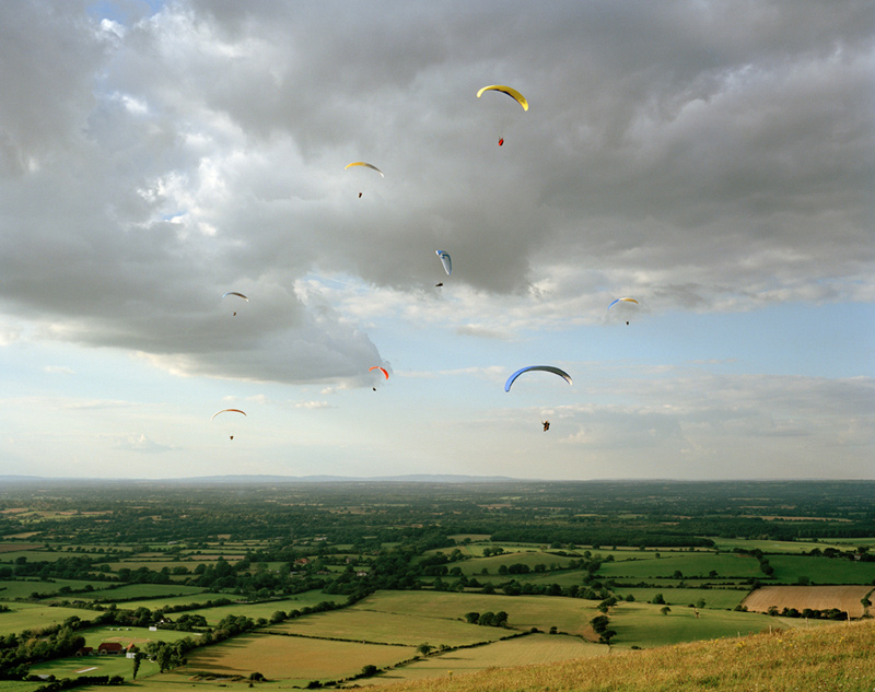 |
| South Downs Way (c) Simon Roberts |
I found the images by Peter Bialobrzeski about urban wasteland transformations - this image from the Lost Transition series is almost ghost like:
 |
| Transition # 20 (c) Peter Bialobrzeski |
Moving on to extreme weather photographer Mitch Dobrowner; to say this image is stunning is an understatement! The small detail of the lit trees brings perspective and context to the overwhelming storm clouds - I love the composition in this image with the storm occupying the bulk of the frame:
 |
| Trees-Clouds (c) Mitch Dobrowner |
Being a big fan of polar landscapes (and desperate to see in real life) I loved the work by Olaf Otto Becker from the series "Above Zero"; again limited colour pallette, simple composition, strong graphic lines - seems to be a winning formula for landscape photography:
 |
| River 1. Position 7. Greenland (c) Olaf Otto Becker |
Another limited pallette, "The Upside Down House" from the project "Tethered to the Polestar" by Ivar Kvaal, obviously a scene of destruction, but also of calm - an "after the storm" feeling:
 |
| The Upside Down House (c) Ivar Kvaal |
These are just a few of the amazing scenes that were on display; I realised that in picking out hte images that most appealed to me, I was drawn to limited colour pallettes, strong graphic lines, and quite simple compositions. These are themes I should explore through my own landscape photography!
No comments:
Post a Comment