In the feedback to Assignment Four, my tutor suggested I look at Sophie Calle and Duane Michals in view of their unique approaches to narratives.
Of the two, I liked Sophie Calle more and found her ideas interesting. I found a few articles on The Hotel, Room 44 in which Calle had photographed different aspects of a hotel room in order to construct a sequence showing the hidden world of the occupant of the room. She worked as a chamber maid to gain access to personal possessions, therefore observing their life, without them realising. This is intrusive and voyeuristic, but I like the approach. Looking at the photos themselves, they work individually as stand alone items, but put together they tell a completely different story.
The work I saw by Duane Michals, I liked less, although again some of his work that I saw is very voyeuristic. However, in contrast, in The Human Condition, Michals creates a sequence of six photos, transforming a commuter into a galaxy by playing with the light and exposure. The sequence in this case is less of a narrative and more of a transformation.
I looked at these photographers after I had completed my work for Assignment Five, so I can't comment on whether they inspired me or not, but I could see that the work by Calle might inspire me in the future.
My tutor also suggested I look at Magnum Photos and World Press Photos; I have "liked" both these sites on Facebook, so that I get a regular update on the news feed.
Tuesday, 2 July 2013

BBC Wildlife Magazine Summer 2013 - volume 31 number 8
Pages 46-53 ran an article, called Saving a Ghost, about the rarely seen Siberian or Amur Tiger and the race to ensure its survival. I was drawn to this article, not only because of the subject matter and the beautiful photographs, but also because of the difficulties the photographers encountered in making the shots:
- there are only around 300 of these tigers left, so they are hard to find
- in the Reserve where the photos were taken, there are only 4-6 cats
- the photographer Toshiji Fukuda who took the amazing picture of the tiger on the beach on page 46 has only seen two in 23 years - they followed the paw prints in the sand
- Toshiji and his assistant endured conditions of -40 C watching out for the tigers for 50 days
I spent one day photographing puffins in Wales and had 800 photos - I can't imagine what it must feel like to wait 23 years for one photo!
 |
| Snow Tiger (c) Toshiji Fukuda taken in February 2012 after months of planning and 50 days waiting |
Sunday, 19 May 2013
Backgarden Blossfeldts
Unfortunately I couldn't make the study visit to the Blossfeldt exhibition at Whitechapel, however, thought I'd have a go at the "homework". What struck me about the Blossfeldt's I've seen online is the focus on the shape and the surrounding space but from a minimalist/simplistic perspective. So I had a look in my back garden for something that would suit the brief. As my garden is paved (dog proofed and too lazy to do gardening) I was reliant on weeds growing around the edges, and unsurprisingly this is what I found:

I also tried the image in black and white, but I think I prefer the minimal palette of the colour.


I also tried the image in black and white, but I think I prefer the minimal palette of the colour.

Sebastiao Salgado: Genesis
I visited the Genesis exhibition in April - a fantastic accumulation of eight year documentary photography. Unfortunately my original write up has disappeared from my blog so I've lost my initial reactions. This has now been rewritten from memory of what I wrote the first time round :-(
I am actually wondering now if it was taken down because I had added some of Salgado's images? Although I attributed them to him, and if you are using them for study purposes this is not a breach of copywrite, I wonder if that is what happened...
Anyway, this was a stunning exhibition. Well worth the visit. Excellently curated with a section for each geographic region. Bags of interest for landscape, wildlife and anthropology. All black and white so really focusing on texture and shape. Great examples for TAOP Elements of Design!!
One thing I noticed was that most of the pictures were grainy - obviously deliberate - does Salgado add this after or is this a result of very high ISO. I also noticed that in some pictures the framing was so tight that parts of e.g. a whale tail had been chopped. Again - assuming deliberate - but why? I think that if I did that - my tutor would complain!
What I loved about the exhibition was the objective: to show landscapes and communities untouched and unscarred by modern life. I also really liked the use of abstract in wildlife, which was something I hadn't seen before, e.g. the lizard foot and the iguana tail.
I have put the book on my amazon wish list for Christmas - I will write more then when I can reference the images more easily.
I am actually wondering now if it was taken down because I had added some of Salgado's images? Although I attributed them to him, and if you are using them for study purposes this is not a breach of copywrite, I wonder if that is what happened...
Anyway, this was a stunning exhibition. Well worth the visit. Excellently curated with a section for each geographic region. Bags of interest for landscape, wildlife and anthropology. All black and white so really focusing on texture and shape. Great examples for TAOP Elements of Design!!
One thing I noticed was that most of the pictures were grainy - obviously deliberate - does Salgado add this after or is this a result of very high ISO. I also noticed that in some pictures the framing was so tight that parts of e.g. a whale tail had been chopped. Again - assuming deliberate - but why? I think that if I did that - my tutor would complain!
What I loved about the exhibition was the objective: to show landscapes and communities untouched and unscarred by modern life. I also really liked the use of abstract in wildlife, which was something I hadn't seen before, e.g. the lizard foot and the iguana tail.
I have put the book on my amazon wish list for Christmas - I will write more then when I can reference the images more easily.
Photography Monthly - June 2013 edition
These landscapes are about sea and sky and describe how Cotton produces almost abstract effects with misty water and moving skies. Looking at the meta data published, he seems to favour ISO 100 (necessary with such a long exposure) with a medium aperture f/11 - f/15 and exposures between one and four minutes - presumably depending on available light - and the addition of a LEE 10 Stop and and LEE ND Grad. The result of this is beautiful with the foreground sharp and the background disappearing into the horizon. Using a long extension subject such as an old jetty is very effective as the eye is taken into the picture by the subject and further on into the blurred horizon. The minimal colour is achieved by post processing. I have noticed recently that I am drawn to landscape images using a minimal colour scheme - not sure why - but I think the simplicity of colour helps emphasise texture and atmosphere - particularly in these almost surreal landscapes.
For examples of Cotton's work, please see his website, as he has explicitly requested for his images not to be reproduced.
However, I can show my own first few attempts at long exposure landscapes with my ND filter:


Monday, 6 May 2013
Finally.....
After 14 MONTHS OF BLOOD, SWEAT AND TEARS....and sulking.....I finally got full marks (10/10) in Kingston Camera Club's 5th print comp this year for my street pic (Hackney No. 2) - renamed "Keeping an eye on the children" for the competition. The judge in question was Rosemary Wilman Hon FRPS former president of the Royal Photographic Society, so it was a result worth waiting for! :-)


Sunday, 28 April 2013
Heather Angel
I was lucky enough last week to go to a talk by Heather Angel at Guildford Photographic Society. Heather gave us a beautiful slide show showing her macro and wildlife images and provided us with some much valued "pearls":
Macro:

Macro:
- Work hard on backgrounds - they can make or break a photo
- If no flash - can use camera bag to cast shadow to make background black
- Use diffuser to reduce light on subject
- Metering pale or dark subjects - spot meter an average tone
- Use a reflector to bounce sun into flower centres
- Use a light tent for photographing individual flowers - produces even lighting - botanical painting effect!
- Bright colours with dark areas - use flash
- Fibre optic light good for texture
- Black velvet and plamps to create black background
- Focus stacking to create total depth of field
- Expect the unexpected
- Meter off neutral tones if subject mainly black or white
Landmark: the Fields of Photography
Here are a few of the images (amongst the very many) that I particularly liked:
I was particularly keen to see the image that had been used for the advertising - Nickel Tailings # 34 and also # 35 by Edward Burtynsky - interestingly a Prix Pictet shortlister up for the Water portfolio:
 |
| Nickel Tailings # 34 and # 35 (c) Edward Burtynsky |
Less disturbing and significantly calmer is the image from the "We English" series by Simon Roberts: South Downs Way:
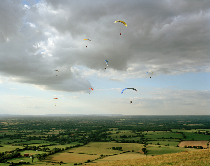 |
| South Downs Way (c) Simon Roberts |
I found the images by Peter Bialobrzeski about urban wasteland transformations - this image from the Lost Transition series is almost ghost like:
 |
| Transition # 20 (c) Peter Bialobrzeski |
Moving on to extreme weather photographer Mitch Dobrowner; to say this image is stunning is an understatement! The small detail of the lit trees brings perspective and context to the overwhelming storm clouds - I love the composition in this image with the storm occupying the bulk of the frame:
 |
| Trees-Clouds (c) Mitch Dobrowner |
Being a big fan of polar landscapes (and desperate to see in real life) I loved the work by Olaf Otto Becker from the series "Above Zero"; again limited colour pallette, simple composition, strong graphic lines - seems to be a winning formula for landscape photography:
 |
| River 1. Position 7. Greenland (c) Olaf Otto Becker |
Another limited pallette, "The Upside Down House" from the project "Tethered to the Polestar" by Ivar Kvaal, obviously a scene of destruction, but also of calm - an "after the storm" feeling:
 |
| The Upside Down House (c) Ivar Kvaal |
These are just a few of the amazing scenes that were on display; I realised that in picking out hte images that most appealed to me, I was drawn to limited colour pallettes, strong graphic lines, and quite simple compositions. These are themes I should explore through my own landscape photography!
Saturday, 23 March 2013
National Geographic - March 2013 edition
This has to be the cutest picture ever...a four day old hoglet wrapped up in a towel at a rescue centre. Getting over the cute factor for a brief moment - this is a very carefully constructed image with the folds of the towel complementing the folds of the hedgehog's face wrinkles and the shape, and the lines of the spines complementing the lines of the edges of the towel. The softness of the towel contrasts with the prickles of the hedgehog. Obviously careful lighting/exposure to create the light within the white of the towel and I'm guessing this has been taken with a macro lens. The photo is attributed to Phil Yeomans of the Bournemouth News and Picture Service. Thank God for rescue centres!
 |
| March 2013 NG - Photo by Phil Yeomans |
Photography Monthly - April 2013 edition
I loved the images of Clevedon Pier pages 22-25 used to advertise this month's geocaching competition. They look deliberately over exposed, with suitably blurred backgrounds, disappearing horizons plus some kind of processing treatment that has made them look elegantly faded called "paint the moon" that adds luminosity - looks like it's compatible with PS Elements? The colours have a slightly acid feel to them. I really like the way images have been chosen that are slightly different rather than typical photos - what camera club judges call "photographers' pictures" Very inspiring and hoping I can find some time to go there this summer.
I also loved the images of Antarctica by fashion photographer Enzo Barracco - I am desperate to go to Antarctica and see the different colours and forms of the icebergs. I particularly liked this image - the iceberg resembles a shark's mouth rising out of the water with it's multiple rows of teeth!
 |
| April 2013 PM page 23 |
 |
| April 2013 PM page 33 |
Finally, the article about photography on the London Underground by urban landscape photographer known as Vulture Labs also inspired me. I found the symmetrical composition very interesting, and also the gritty grimy effect he created. These are scenes that I am used to seeing heavily congested and frenetic - yet he has created images of peace, space and grandeur. Vulture Labs has specifically requested that his images are not reproduced on blogs, so please see his 500px site for photos.
British Journal of Photography - March 2013 edition
Article about Sebastiao Salgado's eight year project, Genesis: stunning stunning monochrome landscapes, nature and anthropology with incredible light. Exhibition starting next month at the Natural History Museum - can't wait! Will write more when I've seen the exhibition.
Toshio Shibata
In the feedback to Assignment Three, my tutor, Robert Enoch, suggested I look at the work of Toshio Shibata in relation to light. Shibata's work is about the drama of natural forces against man-made structures, and in particular dams. Stunning images, almost abstract in nature, the use of light and slow shutter speed creates a really dramatic quality. It's hard to pick out individual examples to comment on as they are all quite similar in terms of subject and impact, but each amazing - better to just look at google images as the collective impact is quite . I would love to see these in large format prints as I can image them to be overwhelming. But, one aspect, I really like is the views of the dams looking down the cascade (how did he get this?):
In this image, the contrast between light and dark is stunning - with the light enhanced by the slow shutter speed allowing the water movement to be blurred and enhance hte reflections. The composition is also very interesting with the contrast between light and dark on the horizontal thirds and then a symmetrical composition between light and dark in the bottom section.
 |
| (c) Toshio Shibata |
In this image, the contrast between light and dark is stunning - with the light enhanced by the slow shutter speed allowing the water movement to be blurred and enhance hte reflections. The composition is also very interesting with the contrast between light and dark on the horizontal thirds and then a symmetrical composition between light and dark in the bottom section.
Boris Savelev
In the feedback to Assignment Three, my tutor, Robert Enoch, suggested I look at the work of Boris Savalev in respect of use of light. Savalev's use of light is obviously very interesting, as his his subject matter, realism in Russia; I like his effective use of shadow, which adds to the sense of mysticism about Russia. In this image below, exhibited in 2009 at the Michael Hoppen gallery, the use of light and shade makes me feel that I'm being given a priviledged glimpse of something that perhaps we are not supposed to witness.
In Girl in a Box, taken in 1981, the contrast between light and dark is quite extreme, but with the coloured areas balanced. Amazing how although the girl is in the dark patches she is shining through. Thinking about context (Leningrad 1981) you can apply different meanings to the light and dark relating to Russia's social history.
 |
| MH2011_14 (c) Boris Savalev |
In Girl in a Box, taken in 1981, the contrast between light and dark is quite extreme, but with the coloured areas balanced. Amazing how although the girl is in the dark patches she is shining through. Thinking about context (Leningrad 1981) you can apply different meanings to the light and dark relating to Russia's social history.
 |
| Girl in a Box (c) Boris Savalev |
Trent Parke
In the feedback to Assignment Three, my tutor, Robert Enoch, suggested I look at the work of magnum photographer Trent Parke. I am already familiar with his work, having seen one of his images, Shark Bay at the A Question of Colour Exhibition in November:
The light in this image is astonishing - crisp shadows, overhead sign, bleached sand and stunning blue sky.
Looking through Parke's galleries on the In Public website, you can see his dramatic use of light and shade - really stark contrasts. The black and white pictures in particular have a real sense of drama and an almost supernatural element. In this image in particular, the use of light has a spooky effect taken facing a low sun with the long shadows, blown light in the background and halos around the pedestrians' heads. A slow shutter speed was obviously also used to capture the blur of people walking in the street making it look ethereal:
I really like Parke's work and am keen to see more of it.
 |
| Shark Bay (c) Trent Parke |
The light in this image is astonishing - crisp shadows, overhead sign, bleached sand and stunning blue sky.
Looking through Parke's galleries on the In Public website, you can see his dramatic use of light and shade - really stark contrasts. The black and white pictures in particular have a real sense of drama and an almost supernatural element. In this image in particular, the use of light has a spooky effect taken facing a low sun with the long shadows, blown light in the background and halos around the pedestrians' heads. A slow shutter speed was obviously also used to capture the blur of people walking in the street making it look ethereal:
 |
| Image 1880, Gallery 2, (c) Trent Parke |
I really like Parke's work and am keen to see more of it.
Thursday, 21 March 2013
Birdseed (c) Keith Wellbelove
Wish I'd seen this!! What a great photo by fellow KCC member Keith Wellbelove taken in Trafalgar Square. It has everything - light, dark, contrast, bizarre scene, and the composition really suits the subject matter with lightest part being the subject, at the centre. Really like the shadows of the heads of the four bystanders - this adds context, anchoring and a sense of voyeurism! I also like the way the edges of the paving stones provide leading lines into the subject, drawing the eye into the centre.
Like me, Keith is very interested in Street Photography, so I'm looking forward to seeing more of his work :)
Like me, Keith is very interested in Street Photography, so I'm looking forward to seeing more of his work :)
 |
| Birdseed (c) Keith Wellbelove |
Sunday, 3 March 2013
Tom Hunter
I had the privilege to attend a lecture by Tom Hunter yesterday participating in an OCA study trip:

I had previously seen his work in the Seduced by Art Exhibition I attended previously, and now I've heard Tom speak, I understand a lot more about this exhibition! What I really gained from listening to Tom, is a greater understanding of what it means to conceptualise your work. I had recently started to gain an awareness that photography is used conceptually, but hadn't really taken it on board fully. Understanding Tom's use of comparisons with the old masters to make a statement about living conditions that he himself has experienced is very powerful. Some of his images are haunting, and become more so when you really appreciate the meaning behind them.
A great experience!
I have also thought of something I would like to conceptualise - to do with the passage of time and the way and which we occupy space.

A great experience!
I have also thought of something I would like to conceptualise - to do with the passage of time and the way and which we occupy space.
Ida Pap
I went to a talk by Ida Pap about ten days ago at the City and Cripplegate Photographic Society. A young, and fairly new photographer, she has a fascinating take on Urban Landscapes, focussing on the minutae of the scene, or the mood, rather than record or achitectural photography. Using light and reflections to create a very dramatic effect, and allowing light to become blown out, Ida creates photographs that are almost bewitching. Until this talk, I hadn't really appreciated what the addition of a person (mostly in silhouette) adds to an image in creating tension and drama.
Very inspiring!
Very inspiring!
Tuesday, 26 February 2013
Miss November
Just had a phone call today that I am Miss November in the Wainwright Society 2014 calendar - I am thrilled :) - this has been a personal ambition of mine ever since I discovered their existence!!!

Friday, 22 February 2013
Ill Form and Void Full
Ill Form and Void Full - an exhibition by Laura Letinsky at the Photographers Gallery visited last Saturday on an OCA study trip.
To begin with, I found it quite disturbing to look at the images. The ambiguity of where the planes lie made me feel uneasy. Once I'd understood that Letinsky is playing with light and shade and showing the relationship between positive and negative space I began to imagine how the scenes were created. Not sure about the subject matter - she is playing with time showing food in various stages of consumption and decay, but why?
To be honest, I found the exhibition interesting, particularly looking at the composition in each and examining thirds, quadrants, bisections, and receding centre-pieces, but I can't say I liked it. Intriguing but not pleasing. I'm not a big fan of still life photography, so may be this has something to do with it - I'm more interested in outdoors subjects - but it has given me some food for thought for TAOP As4!
I did like the white and shadow of white though and particularly with the use of orange in the exhibition and OCA people!

To begin with, I found it quite disturbing to look at the images. The ambiguity of where the planes lie made me feel uneasy. Once I'd understood that Letinsky is playing with light and shade and showing the relationship between positive and negative space I began to imagine how the scenes were created. Not sure about the subject matter - she is playing with time showing food in various stages of consumption and decay, but why?
To be honest, I found the exhibition interesting, particularly looking at the composition in each and examining thirds, quadrants, bisections, and receding centre-pieces, but I can't say I liked it. Intriguing but not pleasing. I'm not a big fan of still life photography, so may be this has something to do with it - I'm more interested in outdoors subjects - but it has given me some food for thought for TAOP As4!
I did like the white and shadow of white though and particularly with the use of orange in the exhibition and OCA people!

Sunday, 10 February 2013
Photography Monthly - February 2013 edition
Very interested in the article about Steve Landeros and his "negative space" style of photography. In fact, I had
commented yesterday on an photograph I saw at the Ansel Adams
exhibition that was about minimilism rather than the usual dramatic
landscape. The article describes the techniques Landeros uses to create monochrome images of mist, fog, blurred water and very little detail but maximum atmosphere. The images often have very subtle and only slightly visible background detail - stunning!
Negative space is created by placing the subject of the photograph to one side of the frame and using the direction of the sky to enhance the composition. Using landscape lenses, Landeros favours very high ISO (50-125), a very slow shutter speed and varying apertures - f/4-f/16 depending on the image. I noticed that with images with blurred and subtle background details, a wider aperture was used. Landeros also uses N-grad filters to darken the sky (I have a set of these :-) !)
I really want to try some shots like these and I will do at my next opportunity to get out on my own and take my time with what I'm doing!
Subscribe to:
Posts (Atom)